Chances are you’ve not spent much time thinking about the logos that surround us. Most people probably wouldn’t be able to explain what makes the Shell logo an enduring icon or why the 2010 GAP logo redesign was a misstep at best. Most of us however have a sense of how important logos are, so lets have a look at what makes a logo good and how we can think about them most helpfully.
![]()
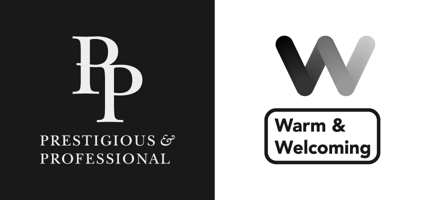
A logo is usually the first point of contact between an organisation and a person (and even if it isn’t, a logo will be present at almost every future interaction). They are powerful communicators of tone. For example, a logo can instantly identify an organisation as “prestigious and highly-professional” or “approachable, warm and welcoming”.
If you couple a logo’s prolific presence in an organisation’s life with a logo’s potential to communicate, you start to get a picture of why logos matter. A logo becomes not just a signifier of an organisation, but a vessel for the emotions people feel towards that organisation. A good logo is taken by those who love the organisation and made their own. As a side note, this is why when a company or organisation changes their logo, the public’s first reaction is usually negative.
So it’s crucial to get your logo right. But how? What makes a good logo? Good question. Let’s take a look.
What makes a good logo?
Firstly, a logo needs to be useable. In order to let the logo do it’s job – representing your organisation and it’s values – you’ll want to be using it constantly.
What are the things to be looking out for in a usable logo?
- The logo works as both a colour version and a black & white version. This will let you use it on all types of backgrounds, from a minimalist blank white expanse, to a cacophony of colour and shape.
- The logo functions well in both a horizontal and vertical arrangement. This will let you put the logo in a variety of places, from business cards to bookmarks, without compromising it’s capacity to communicate.
- Is the logo enduring? Would this logo have looked out of place 10 years ago? The chances are that if the logo would have looked bad in 2007, it will look unprofessional 5, 10 or 20 years from now too.
Ok, so you’re pretty sure you can safely paste your logo onto every surface your organisation comes into contact with. But, if the logo doesn’t accurately communicate your organisation, then what’s the point?!
What are the things to be looking for in a great “on-message” logo?
- The logo’s tone fits with the core values of your organisation. If your organisation is a church, you’re probably aiming to be welcoming. In that case you probably don’t want your logo to look like it belongs to a major law firm.
- Colours play a major role in tone setting. Colours have strong connotations associated with them (e.g. green evokes growth and vibrance; blue is often associated with technology, professionalism and innovation). It’s good to check that your colour choices line up with your branding.
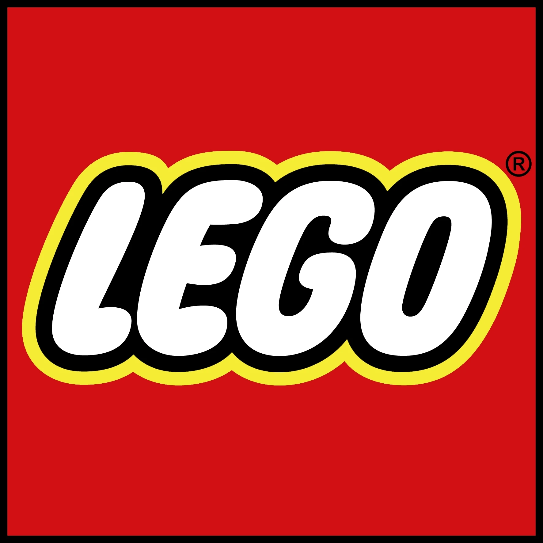
- Font choice is inextricably linked to tone. Every font has its own personality. Some fonts feel at home on children’s toys (think the LEGO font), while others could make The Very Hungry Caterpillar feel at home on an investment banker’s bookshelf (imagine HSBC’s font). An “on-message” font matches and strengthens the overall mood of the organisations branding.
- It doesn’t try to achieve everything all at once. A logo can’t (and shouldn’t) communicate everything about your organisation. Churches often want to communicate that they are welcoming, christ-centred, trustworthy, and safe, to name a few. However, a logo would overly cluttered trying to cover even just these four points. Trying to make a logo communicate lots of ideas, ironically, hinders it’s ability to communicate any of them.
- The logo’s symbolism is inferred, working in suggestions and connotations. It’s almost always more effective to use suggestions and connotations than to be heavy handed. Often explicit symbolism (globes, hearts etc…) limits the logo to one interpretation, which in turn limits peoples ability to attach meaning and feelings to a logo.
![]()
How do you get a good logo?
So you’ve thought about you’re organisations core values, and you’ve reflected on your non-existent (or ageing) logo. How do you go about getting a useable, effective, on-message, all-round great logo?
Pay your designer
The first thing I’d recommend is finding someone who knows what they’re doing, whose previous work you like, and paying them to do it. This isn’t just because as a designer, I like to get paid for my work (being able to eat is fantastic!). It’s because without payment, the client/designer relationship is a very murky place. If you’re looking for a logo for your church, you might have a designer in your congregation, and they might be fantastic, but if you’re not paying them for the work then there are no clear expectations for either party. By way of example, the designer is much more likely to be resistant to feedback and iteration, while you’re likely to feel compelled to love (and use) the designer’s work.
Build a solid brief
The designer can’t do much without a strong brief to guide them.
A strong brief can include (but is not limited to):
- Information about your organisation, especially your core vision and values, and the demographic/s you’re aiming to communicate with.
- A section outlining the mood/vibe/tone you’re aiming for, using plenty of descriptive language. Words like growth, vibrant, contemporary, simple, stately etc… are helpful.
- An indication of other organisations in the same field, along with what you like about them (and their design) and where you’d like to be different to them.
- If there’s previous design work that the new logo will need to work with, you’ll need to supply this.
- Some suggestion of colours you like, although keep in mind that the designer is likely to better understand how colours communicate and function in a logo, and might have other suggestions.
- If you already know some of the main places you’ll be using the logo, it can be helpful to indicate this.
One common pitfall to be careful of is including interpretations of the brief, in the brief. After all, interpreting the brief is a designer’s job and skillset. For example, do write “We want the logo to communicate growth”, but don’t add “Therefore, the logo should include a plant”. Do include “Our flagship product is ‘X'” but don’t write “The logo must incorporate a rendering of our flagship product”.
Remember that this process is not about setting and forgetting. It’s about clear communication from both sides, and making sure that everyone knows what they’re working towards. The designer will (almost certainly) need to ask questions of you and help refine your brief, re-working it with you until both parties are happy. Face-to-face meetings are optional but can be fantastic for ensuring clarity.
Make revisions a part of the process
The design process should include iterations, revisions and feedback.
I find that the best way to arrive at a logo that the client loves is by having a few rounds of design. The first will be comprised of between 4 and 6 concepts. The client then picks two (or three at a stretch) of these directions to be explored further and offers feedback (the more specific this feedback the better). At this stage the client is also free to mix and match elements. After these choices have been explored, the client chooses one to be refined further (paired with more feedback) or chooses one to roll with. From here, the logo just needs to be exported to various file types and packaged up ready for the client to use!
I’m passionate about graphic design that helps organisations communicate effectively and truthfully. So I really hope that this post have given you insight into the importance of a good logo, and that maybe you’ve got a bit more of an idea of how you might go about getting a good logo.
To finish up, here’s a couple of…
Things to remember along the way:
- Someone will dislike it.
- You payed the designer. If you don’t like the work, don’t feel bad about not using it.
- Logos are highly diverse and scarily close to art. There are plenty of logos that break the rules and still work. This doesn’t mean the rules aren’t still valid and good.
- Bits of the advice in this post are based on my experience and how I like to work with clients. Your mileage may vary.
- A good logo only becomes truly great when it has had time to become synonymous with a great organisation.