Towards the middle of last year (2015) we at Open Box Technology started thinking about building our own website. As a company that builds websites for other people there was a lot riding on this project! We met to discuss our plans and identified ways our website needed to function.
Firstly, the website is a business tool, allowing people to learn about our work and contact us. Secondly, the website is effectively a demo site showcasing our web design and development work. After talking these through we arrived at a simple set of four priorities for our website.
- It should be very user friendly, in order that potential clients can find answers to their questions. (We’ll call this: User Experience)
- It should communicate what we do and our values as a company. (Communication)
- It should be low maintenance, easy to customise and easy to add content too. (Content Management)
- It should be modern and attractive. (Visual Design)
Lets have a look at what we built and how we tackled each of these goals.
User Experience
One of the main factors in how easy a website is to use is it’s overall layout. We tried to keep things as streamlined and understandable as possible in this respect. Every page of the site is accessible from a menu item at the top of every page.
The next thing we worked at to help with user experience was the layout of a standard page. We tried to use consistent sections in each page so that users feel familiar with the material. A page starts with a large simple heading section to clarify the content of the page and help orient the user. Following this is an image, and then a series of sections containing the bulk of the information for each page. 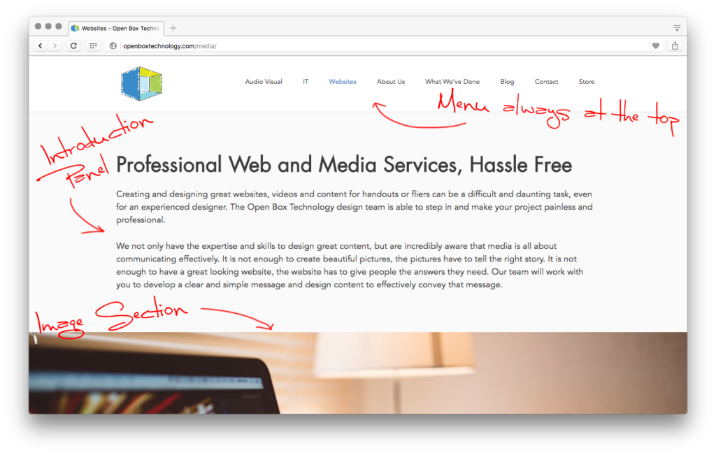 We chose fonts based not only on their clarity but also their character. The fonts used (Futura and Avenir) both have warm, clean and modern characteristics, allowing us to communicate these feelings visually.
Lastly, and perhaps most importantly, we worked hard to have good copy text. Good copy text isn’t just text that conveys all the information it needs to! It also needs to be clear, succinct, and have the right tone. We used this system as a guide for our writing: Write it –> Cut it in Half –> Check the Tone –> Cut it in Half Again –> Check that it’s still clear. If it’s still clear after you’ve followed the steps, you’re good to go!
Communication
Websites are first and foremost a tool for communication. As such, we designed our to answer a few questions.
1: Who are you?
We use our front page to start answering this question. It says we are “Christian workers in the technical and creative industries…help[ing] churches do technology better.” This question is also answered in far more detail on the “About Us” page.
2: What do you do?
What we do is also answered in two places. The first is the “Audio Visual”, “IT”, and “Websites” pages. Each of these goes into depth answering this question with regards to their specific field. The other way we answer this question is through our “What We’ve Done” page, which has a collection of the projects we’ve worked on to give concrete examples of the types of things we do.
3: Why do you do it?
We don’t just work at Open Box Technology because Nick is a good boss (though he is), we really do think that the work we do here is important. As it says on our front page “We believe that technology can be a powerful tool for the gospel, so we desire to serve God and his Church by bringing technology to churches in a relevant and effective way.” Our vision is important in how we work and relate to our clients, so we’ve made sure its right there on the front page. You’ll also find it echoed throughout the “About Us” page, sprinkled throughout the various blog posts, and (hopefully) infused into all the other text on the website.
Content Management
We wanted our site to be really easy to customise and add content too. Not just for our sake, but also (because as our site functions like something of a demo site for our web design) for the sake of any clients we might build websites for. We wanted to show that you can have a beautiful and customisable website that is easy to update and manage.
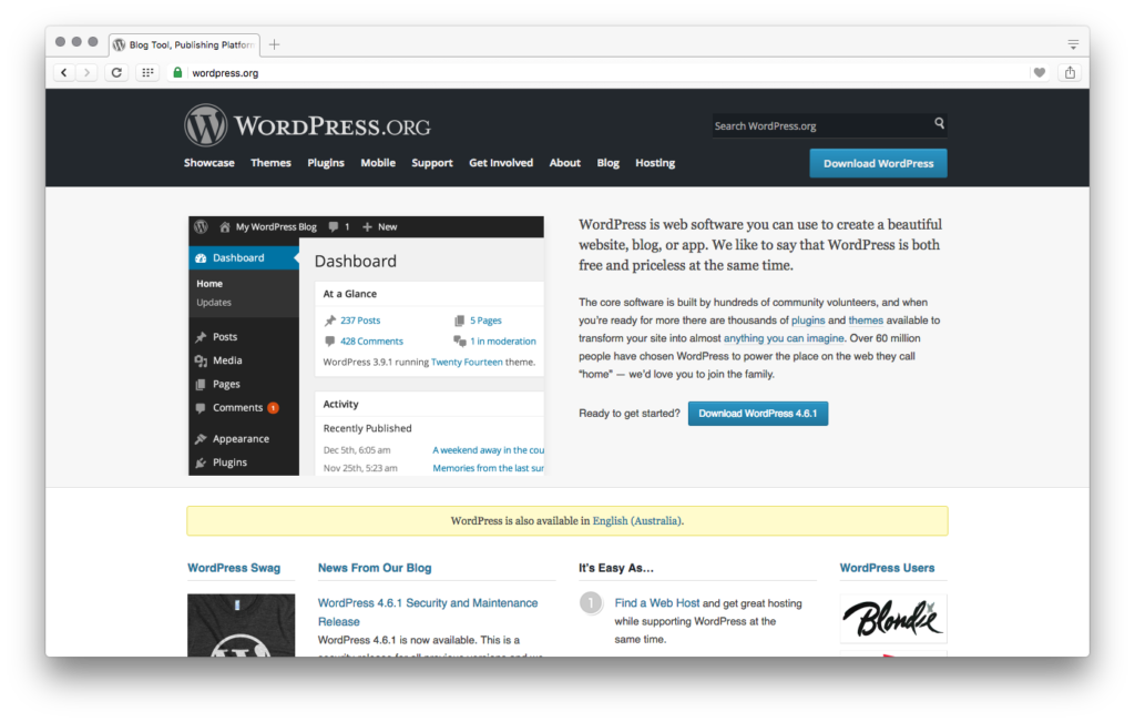
So we explored the best Content Management Systems (CMS’s) and chose to use WordPress. We made this choice for three main reasons:
- WordPress handles security and stability updates. This means that we can focus on content and not waste large tracts of time reacting to new types of online attack.
- WordPress is easy to learn to use. We were up to speed building and updating our site in no time. This is an important consideration for us as we want websites to be a tool for every church, not just those with a resident web designer or developer.
- WordPress doesn’t sacrifice it’s power and flexibility at the alter of simplicity. It’s actually hard to find the limits to WordPress’s abilities. This is due in part, to almost 50,000 available plugins which add all sorts of functionality. You can see this on our site from the testimonial rotator at the bottom of each page to the contact form on our “Contact” page.
In addition to picking WordPress as our CMS, we needed to pick a theme. We ended up going with Generate Press. Generate Press customises really, really, well. If you look at their website and then back at ours you can see just some of the range it offers. It’s also unobtrusive, as we were designing our site Generate Press didn’t force any preset styles on us, and let us change everything we wanted to. All these things are very helpful when building a website, but the best thing about Generate Press by far, is the customer service. Tom (the lead developer) seems to have already answered every question under the sun, and if somehow you manage to find one he hasn’t he’ll reply within the day, it’s nuts.
In case it wasn’t clear yet, I highly recommend using Wordpress as your CMS, and Generate Press as your theme.
Visual Design
When we started to think about the look of our website, we first sought inspiration in sites we love. The two that come immediately to mind are xero.com and Comic Sans Criminal. We where also mindful of the general trend in web design at the moment towards single page websites, structured only by their use of full width sections.
Visually designing websites is also definitely part art. I’m a graphic designer at heart, so this is my jam. I wanted the visual design of our website to reflect and reinforce our branding and the values mentioned above. I did this by using our company colours, thoughtful font and image choices, and by opting for a clear, open, and bright layout.
I hope in running through our approach to web design, I’ve offered some things to think about when you come to building or updating your next website.
If you have any questions about our process or want to explore what it might look like for Open Box Technology to be involved in your website we’d love to hear from you!
![]()